My name is Austin Becker, and I am studying graphic design at East Carolina University. As I continue to take classes and grow as a designer, I have noticed a few things about myself and what I gravitate towards when it comes to design. In many of our graphic design classes we will start off with a grid of some sort. While working with a grid isn’t necessarily my favorite, it has made me realize that I like geometric design. Sharp shapes I find tend to lead the eye from one place on the page to another, and once the grid is taken away, you can start to see how your designs flow together and how you can make a viewer's eyes flow from one part of design to the next. While I like most typefaces, my taste in typefaces tends to typically point me towards serif typefaces due to their geometric shapes and hard corners, like Futura or San Francisco Pro.
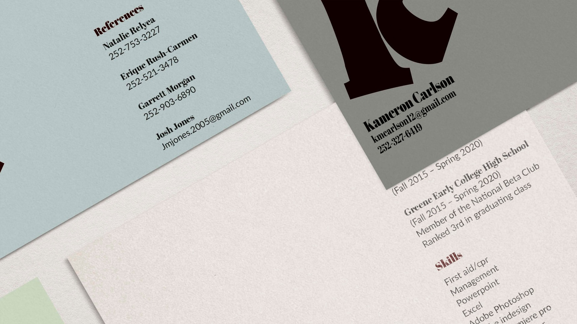
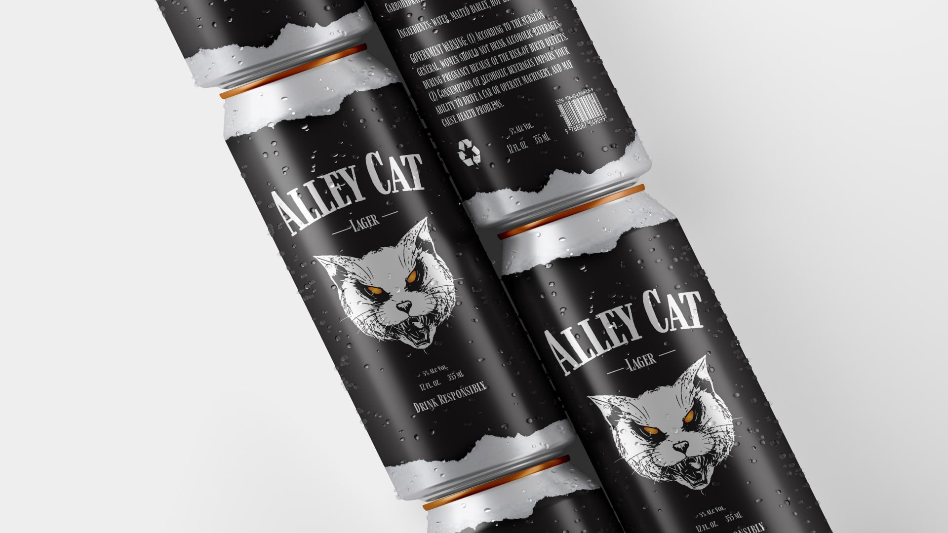
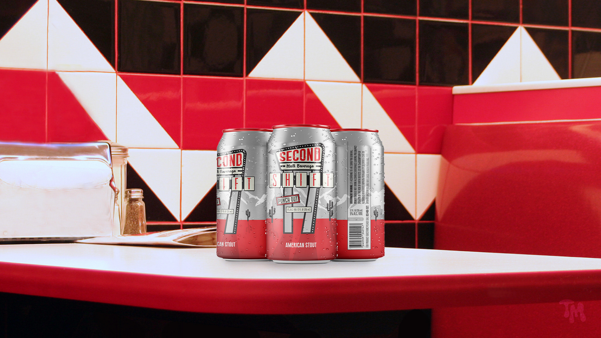
After several semesters of taking art classes, specifically graphic design classes, this portfolio is a showcase of my projects I have completed in the last year. The first I have in my portfolio is my resume with my personal mark and brand identity. Like all of my projects, the first step is always pencil and paper sketches to get a bunch of ideas out of my head and onto paper. My personal brand sticks with my enjoyment of more minimalistic design, so my brand identity has a simple blue line splitting the headings and text with not much else. The second project for that class was a beer design, and I came up with the idea of an old west theme. Like many of my projects, I did extensive research, which is how I ended up with bold type and an old paper background.
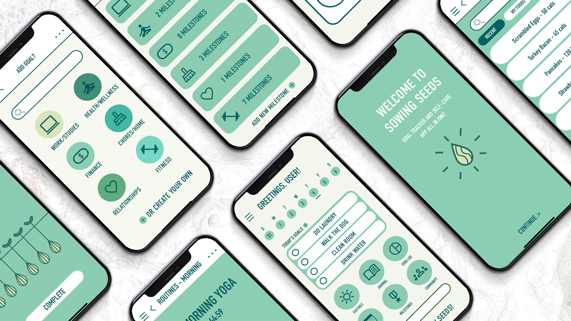
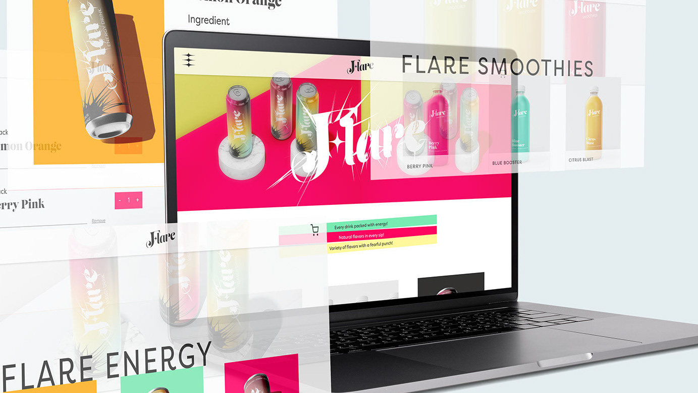
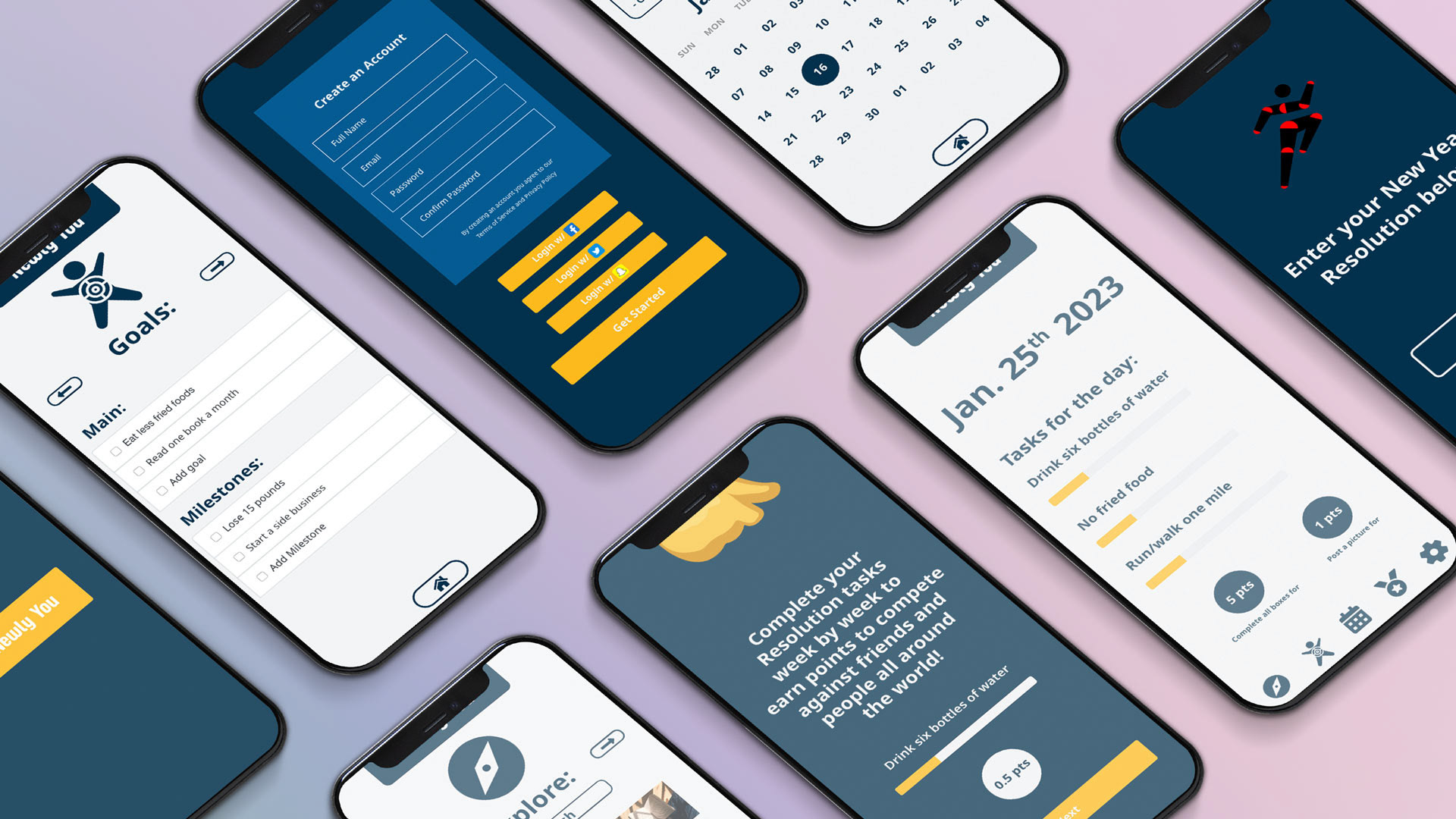
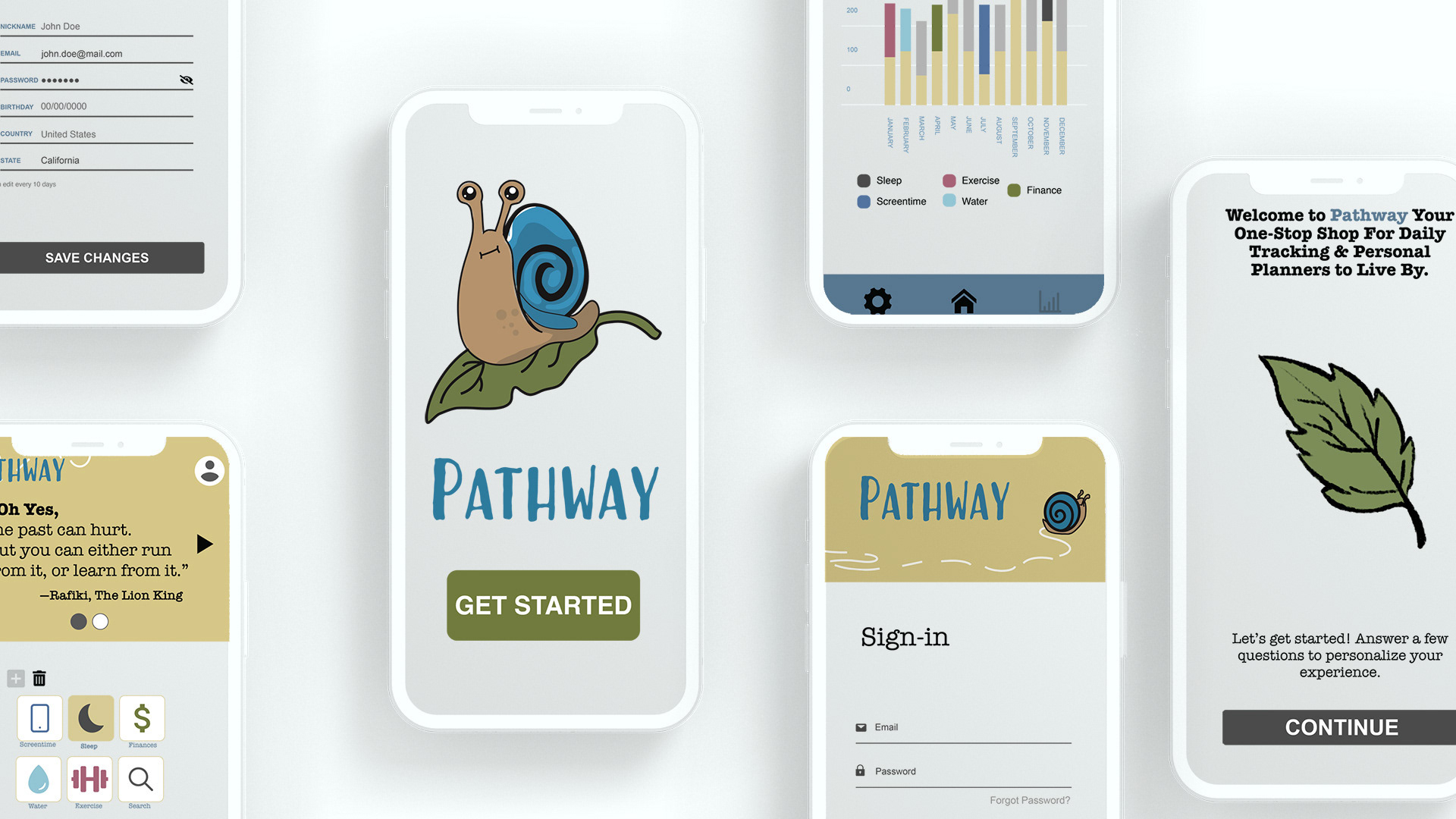
This past semester has really opened up my eyes to the many different applications of graphic design, from experimenting with burning paper to using augmented reality to design in more than the usual two dimensional way I approach design. As we started up a project for a goal tracker app, I challenged myself to make an app that fit within the same style and system Apple uses for all of their first part apps, which demanded that I adhere to their style and design philosophy. The project opened my eyes to designing within a preexisting system which was really insightful for how companies often have their own grids, typefaces, colors, and style guides. My last two projects have been polar opposites in terms of design, one using digital components in a virtual space, while the other was a book cover I decided to use analog methods to get my desired ideas.
As I have continued with the many projects I have worked on, it has helped me move outside of my design bubble and experiment in ways I had never thought of before. Some of my favorite projects have been ones that require me to try something new, which helps add to my design experience and adds a new tool to my shed of ideas and approaches I can take to a new challenge.
