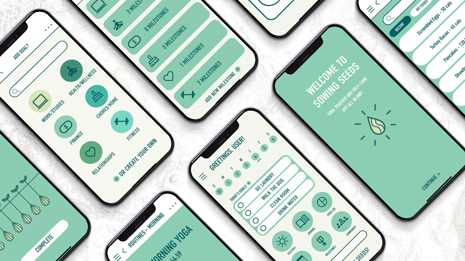
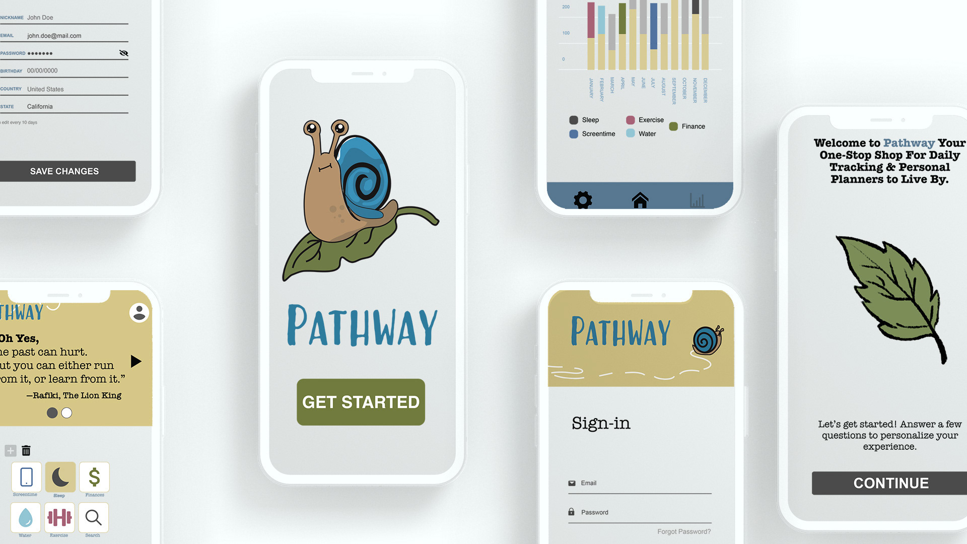
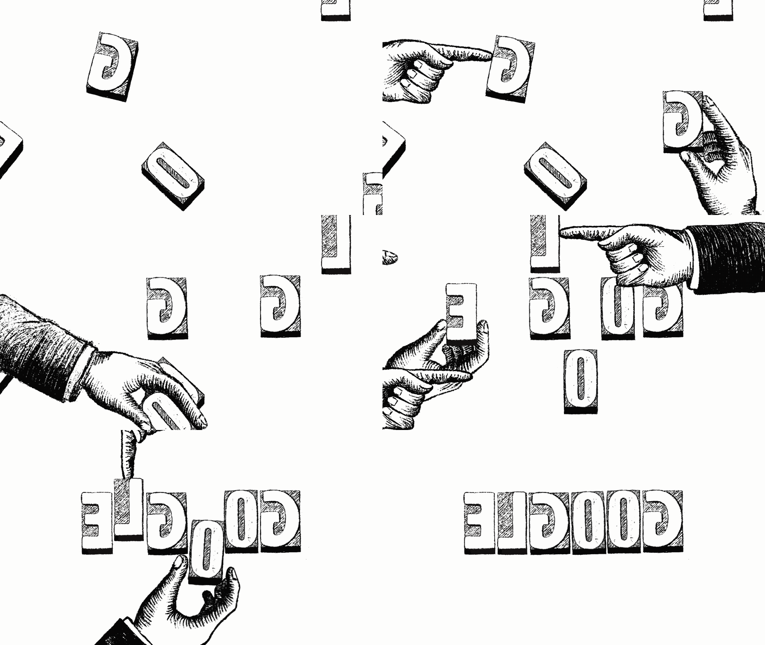
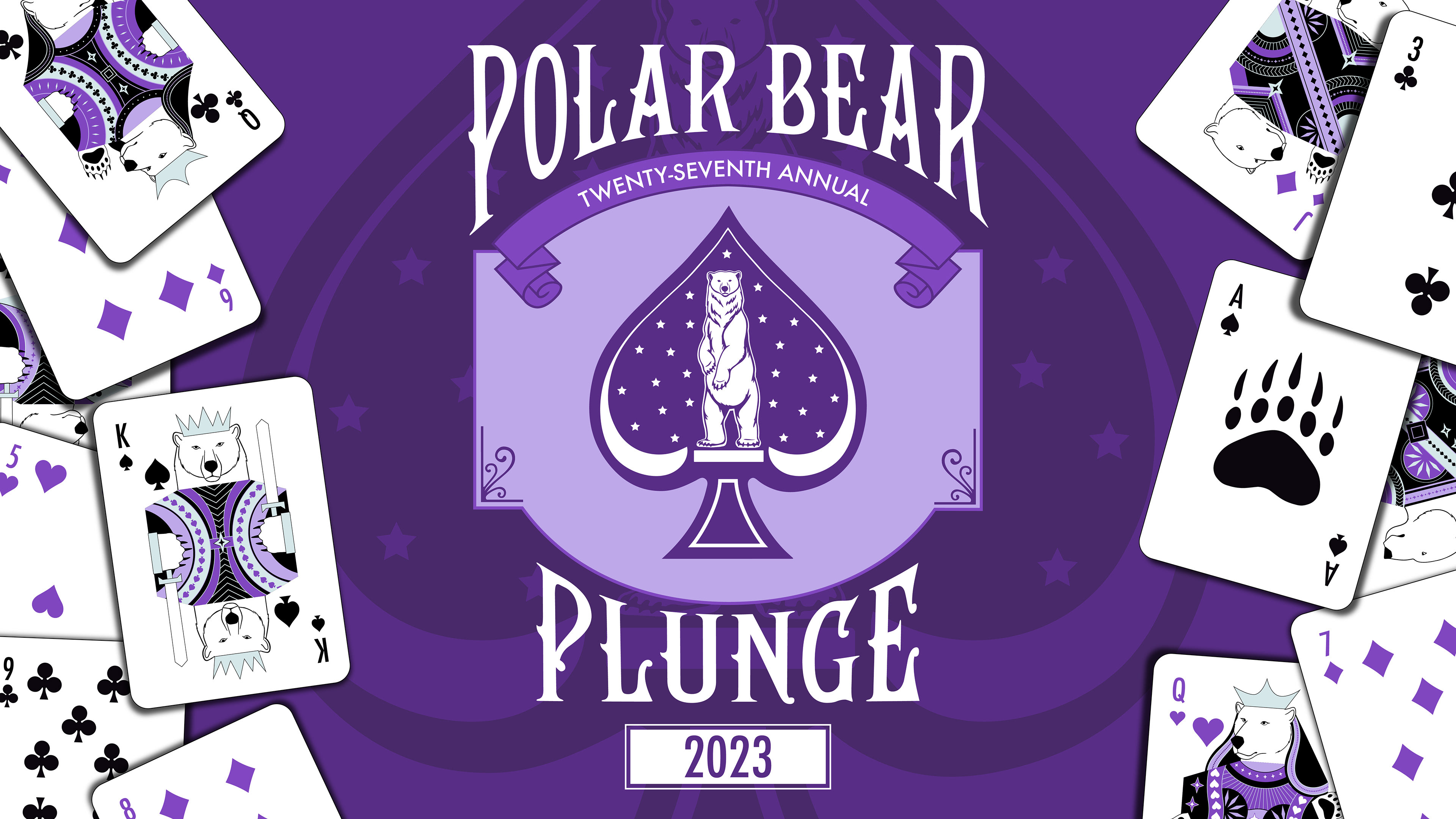
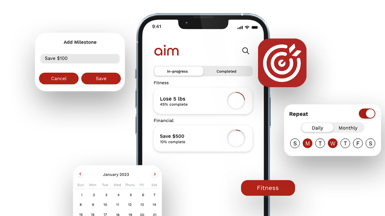
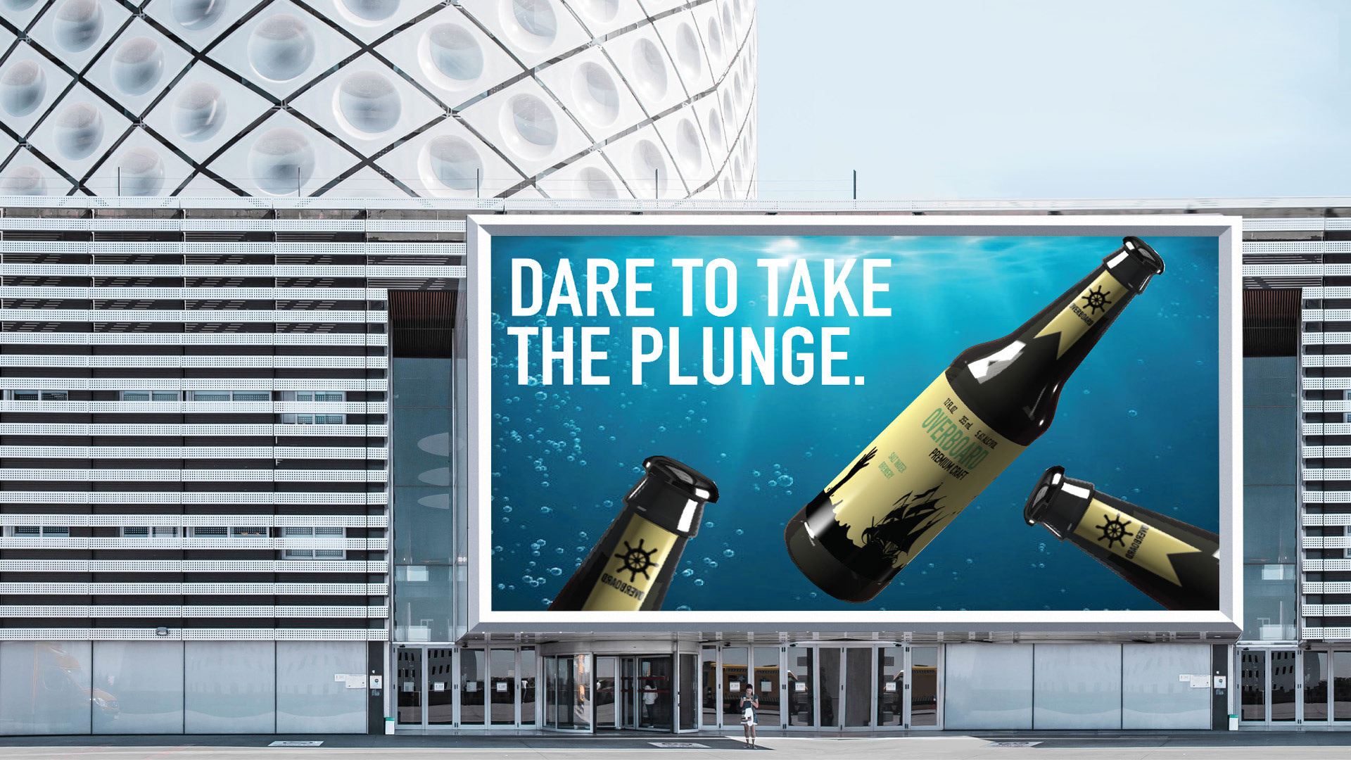
As a graphic designer, the techniques significant to me are to have a clean yet fun stylistic element. I aim to have a balance between shapes and color. If I use a clean line design, I’ll try to add a pop of color to bring some edge to it. Or if the design itself is fun, I’ll use more neutral colors to bring balance to the piece. The process I go through is to jump headfirst into the design! Then by making edits as I work, creating multiple versions with slightly different alterations. I add some pieces from one variation to another for a while, eventually coming to a conclusive design.
I balance self-expression and client needs through extensive research on who the client is and wants. As every other graphic designer, my style is interwoven in everything I design, even if I don’t try. The client’s voice should come through my work in a combined force. As a designer, I want my style to be recognizable, yet always evolving.
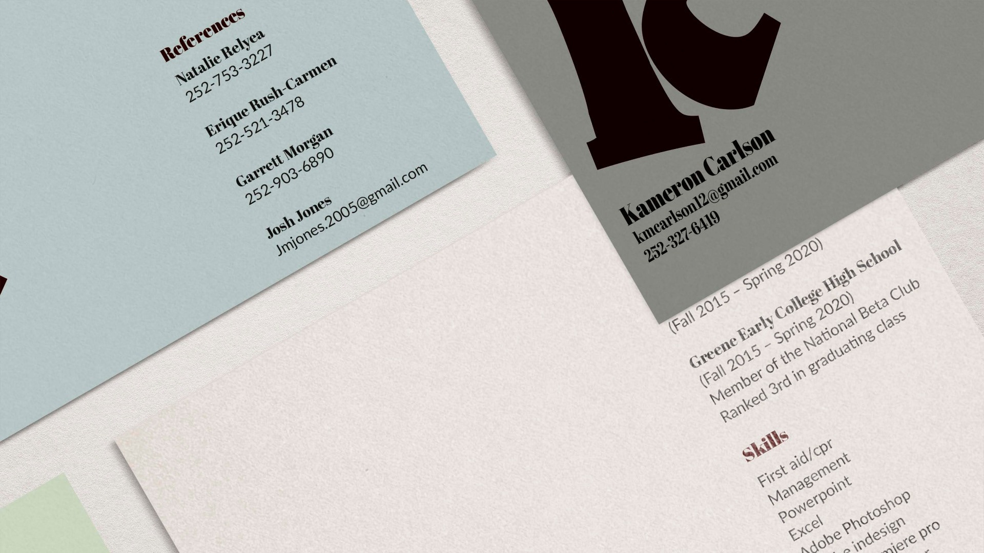
The rise of image-heavy culture is not a huge concern for me. I think the emphasis on negative space is always the right answer. When a design is surrounded by many/large images, I focus on using minimal and clean type. I think using a combination of serif and sans-serif type can be a great way to add hierarchy in an image-heavy design.
The design elements that are significant in creating a “brand” for oneself is choice of color, type, and shape. For example, my personal mark is a rounded sans-serif type in a light purple color. The combination of the rounded edges and playful color give insight to who I am as a person! I like to reflect my personality in my work through my choices of typographical styles and use of colors.
